
Comparing pre- vs post-launch metrics (1 month window)
*Successful completions measured by a user's ability to fix errors and submit an inquiry. Data collected via screen captures.
Successful completions
Support tickets
Engineering time clarifying orders
the problem
The old configurator caused major friction (inconsistent feedback, unclear dependencies, and outdated visuals that broke trust at every step
Our Goal
Modernize the interface, fix usability gaps, and align the tool with our new design system to create a smoother, more confident self-service experience.
Research & Key Findings
Through research, I shaped the final page structure to keep what worked, clarify quantities, and improve accessibility.
Methods Used
User Surveys (6 participants)
User Testing Sessions
Heat Map Analysis
ISSUES UNCOVERED
01
Confusing Part Dependencies
Vague error messages left users unable to understand why parts couldn't be selected
02
Missing Validation Feedback
Unclear visual guidance left users uncertain about their selections
03
Accessibility & Brand Issues
Low contrast failed accessibility standards; outdated styling broke brand consistency
My role
Led the design phase, guiding the process from research to final prototypes
Shared user testing and heatmap insights with cross-functional stakeholders to inform decisions
Mentored a junior designer in Figma and coordinated with our software intern to review and approve components in Storybook
Focused on UI refinements and exploring new technical features while managing QA responsibilities
Page Structure, Visual Hierarchy & Branding
Through research, I shaped the final page structure to keep what worked, clarify quantities, and improve accessibility.
Preserved the familiar part-selection flow — testing and heatmaps showed minimal friction with the existing layout.
01
Clarifying the Interface
Distinguished fixed-quantity vs variable-quantity components
02
Increased Contrast, Replaced Teal with Brand Blue
Met accessibility standards while aligning with the updated design system
03
Clearer Category Headers and Grouping
Improved scannability and helped users understand their place in the flow
04
Components Rebuilt in Design System
Ensured long-term scalability and consistency across the product
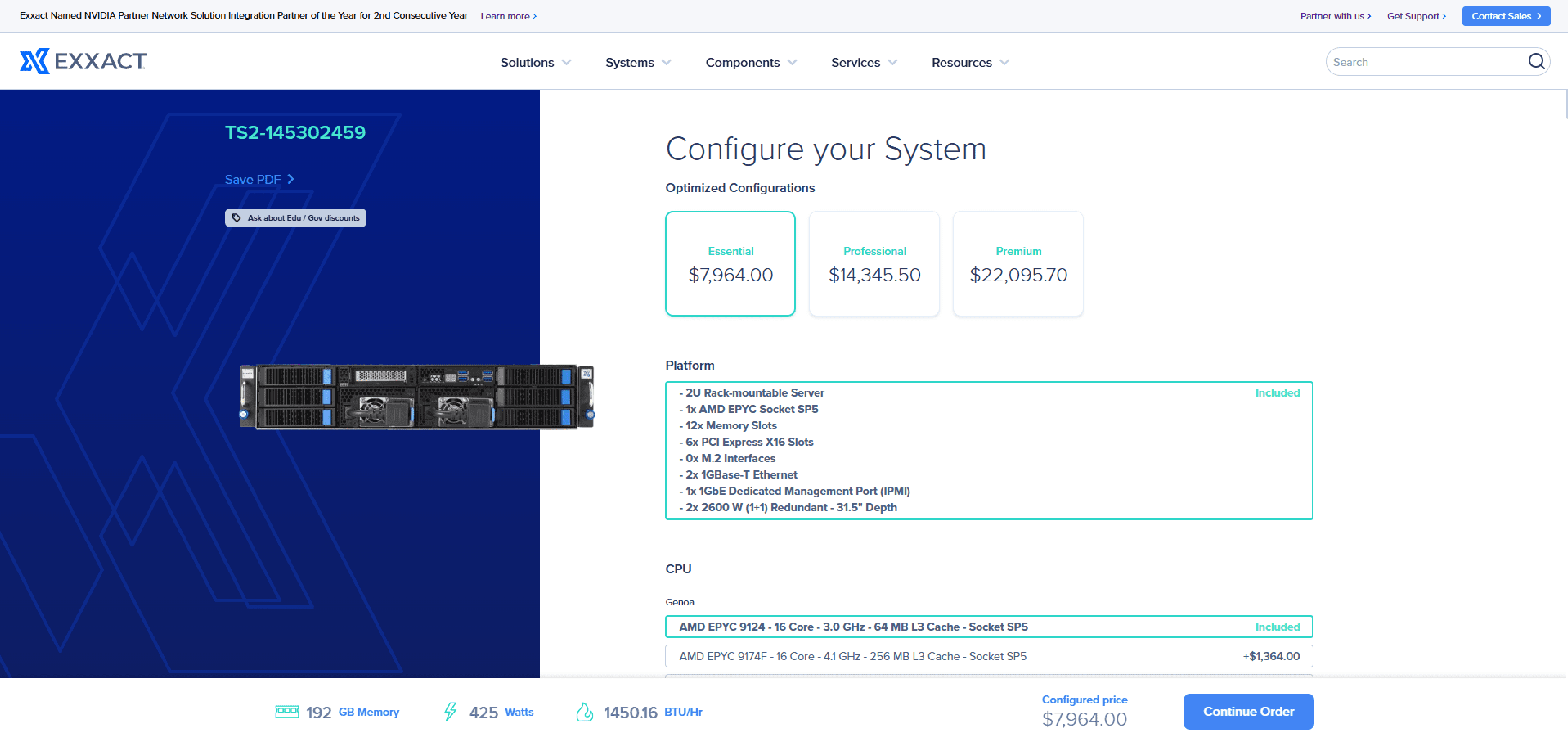
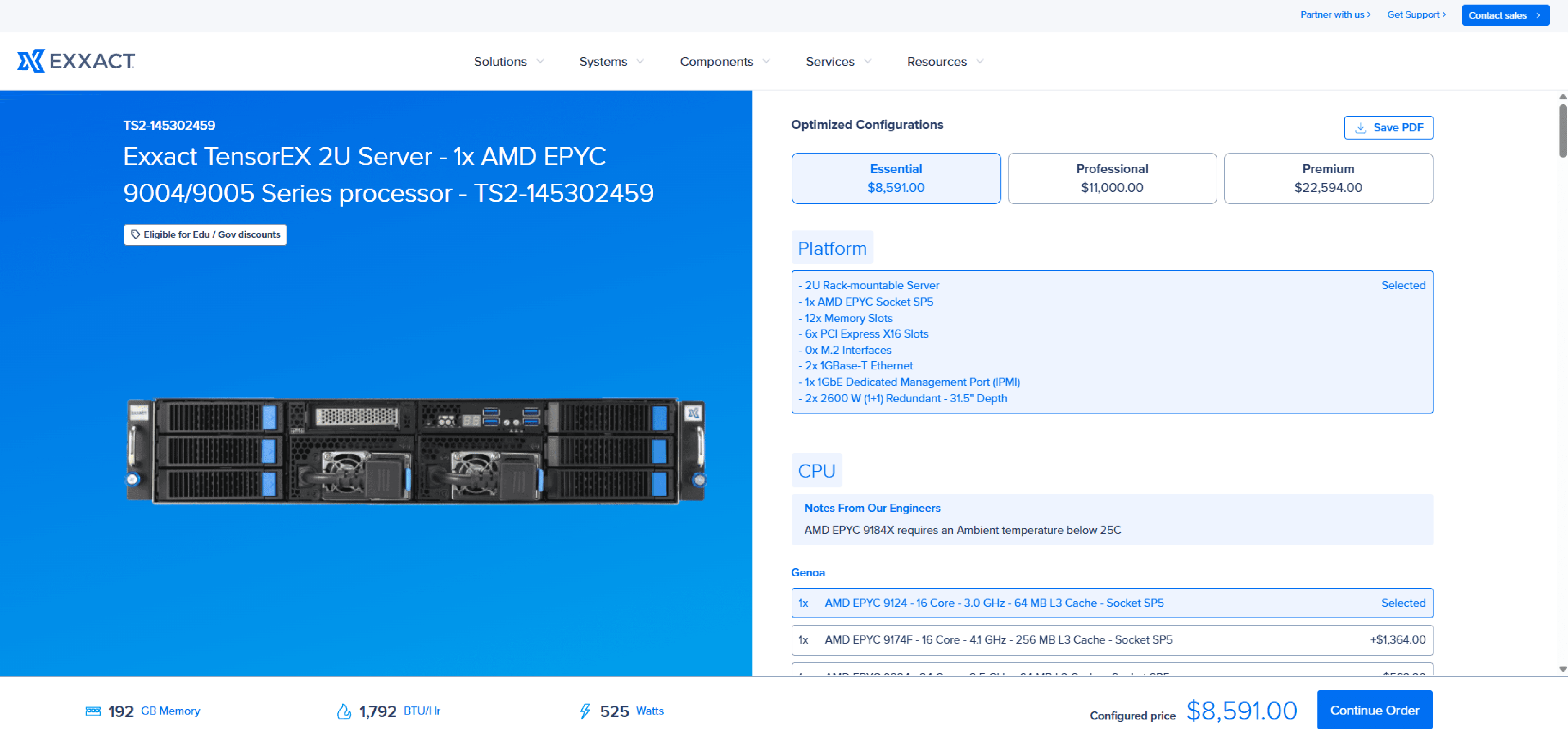
Sales Engineer at Exxact Corporation
Interaction Enhancements
Added visual cues showing disabled state until prerequisites are met, reducing user confusion about what to do next.
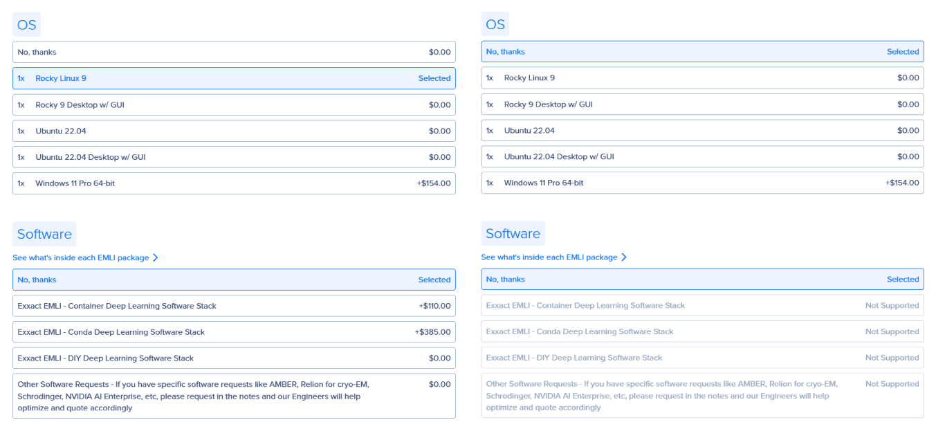
The Interaction
Selecting "no thanks" in the OS category will show Software parts in a disabled state until an OS is selected
Why It Matters
Users no longer hit silent errors — they see exactly what's blocked and why before they try to proceed
Feedback Improvements
Added loading states for perceived speed and error-recovery animations that guide users back on track without losing their progress.
Loading States
Added loading states for perceived speed, reducing user uncertainty during longer loading operations
Error Recovery
Animation replay when submitting configurations with errors + scroll to error functionality
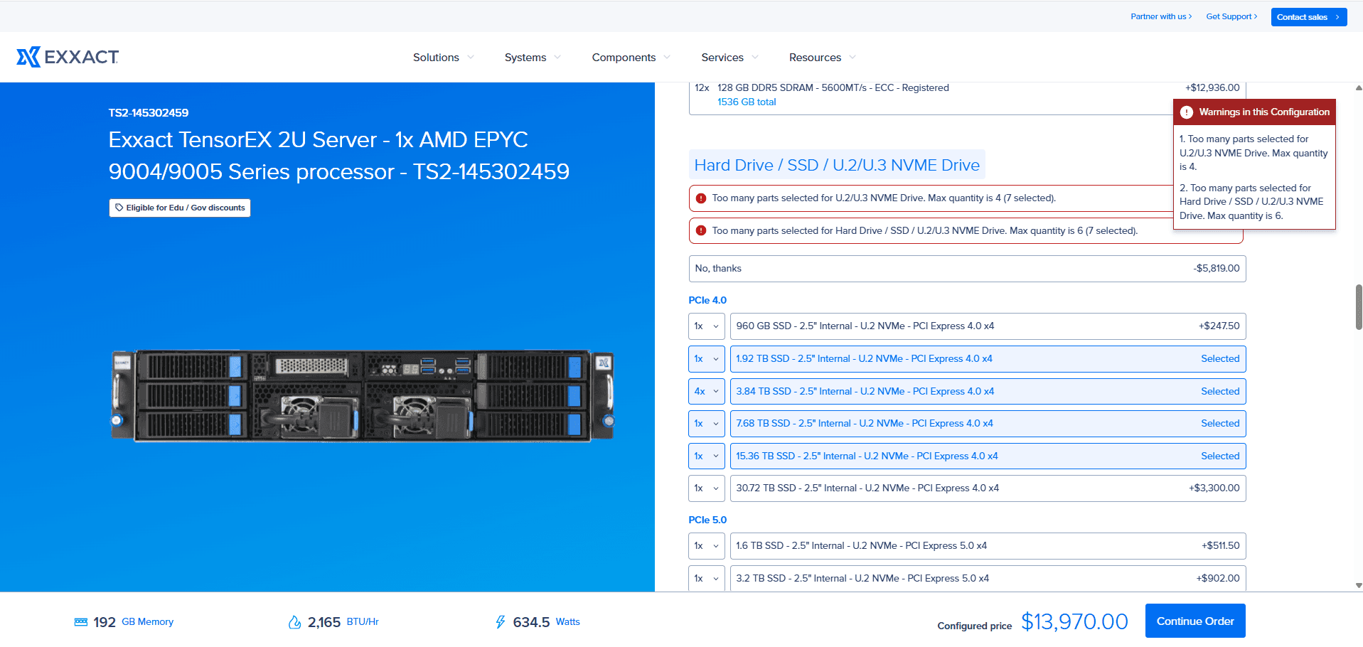
Error Handling
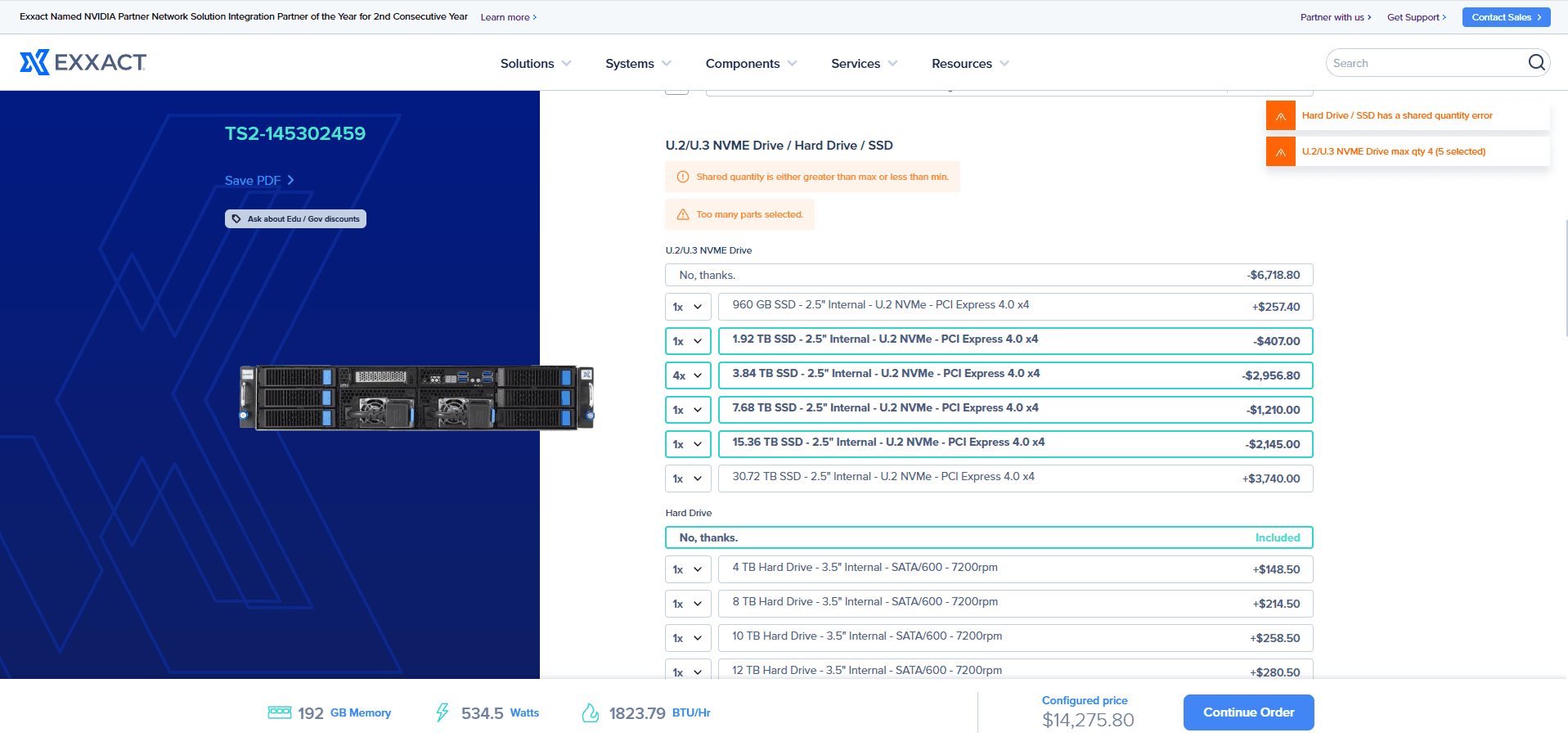
Improved error messages to clearly explain the issue and guide users toward solutions — not just tell them something went wrong.

Vague message with no path to resolution — users didn't know what to fix or where

Specific, contextual, actionable — tells users exactly what to fix and where to go
QA
As QA Lead, I ran a month-long internal testing cycle — creating a comprehensive checklist covering all edge cases, identifying, documenting and resolving bugs covering data syncs, calculation logic, and spec formatting.
Some of the issues resolved are showcased on the right.
| Issue | Solution |
|---|---|
| GPU category ordering in emails differed from the configurator interface | Standardized ordering across all customer touchpoints |
| Platform and parts information not updating correctly in customer emails | Fixed data passing between configurator and email generation system |
| Total memory calculations were hard-coded and not updating correctly | Implemented dynamic calculations based on actual component selection |
| Product listing order inconsistency between builder and final display | Synchronized ordering logic across the entire configuration flow |
| Memory totals displayed even when "No Thanks" option was selected | Modified logic to only display totals for actual component selections |
| Memory dropdown quantities not reflecting minimum configuration requirements | Implemented dynamic dropdown adjustments based on system requirements |
| Incorrect Watts and BTU/Hr specifications in PDFs and emails | Implemented precise calculation and formatting for power specifications |
| Configure buttons appearing incorrectly on the website due to partial MPN matches | Implemented exact MPN matching to ensure proper button display |
Reflection
How this project felt, measured in challenge, teamwork, and the occasional missed lunch.
Invest Upfront to Reduce Debt
Past quick fixes led to integration issues. Thorough research upfront keeps the system healthy and reduces downstream complexity.
Prioritize Maintainability
Simplifying component behavior and reducing assumptions created a more scalable design system that teams could actually use.
Align Early and Often
Staying closely synced with engineering and QA improved technical decisions and surfaced constraints earlier in the process.
Clarify Testing Protocols
Hardware-based edge cases highlighted the need for clearer documentation and a better split between automated and manual QA paths.
Build Logic First, UI Second
Several components broke during integration because they were built with hard-coded text or without real data context — logic must come first.

